
Anthropologie 2017-2019
Anthropologie iOS app
As more and more users choose to shop on mobile devices, having a functional and beautiful mobile app has become an industry standard. In May 2018, Anthropologie released their redesigned iOS app, equipped with all the features found on Anthro’s website, plus app-only benefits.
A major goal of this project was to create one white label product that each URBN brand (Anthropologie, Free People, and Urban Outfitters) could stylize and fit to their business needs. Working closely with UX, development, and sister brand UI teams, I was able to lead Anthropologie’s brand styling from initial creation to implementation.
Since the launch, the Anthropologie app rating in the app store jumped from a 3.3 star review to a 4.9, propelling it to one of the top rated shopping apps on the market. The redesign (combined with marketing efforts) increased the amount of new app downloads (+22%), monthly active users (+25%), and overall app demand (up to 15% from 12% of total demand).
I. The Brief
Update Anthropologie’s UI System
Before the app redesign, our previous app UI was stylistically outdated. With this project, I was tasked with creating a modern look and feel for the brand to match the rest of our creative content. The legacy app was also difficult to use due to its low color contrast, small type sizes, and small tap states, so a major goal was to create an accessible experience.

Create a Unified Experience
The legacy apps for each brand were completely different apps that had varied UX approaches. For example, UO used a left hamburger nav, FP used a tabbed nav and AN used a visual card nav (shown below). With this redesign, each brand’s app would be on a white label platform and share the same UX, based on wireframes created by our UX team.

II. The Process
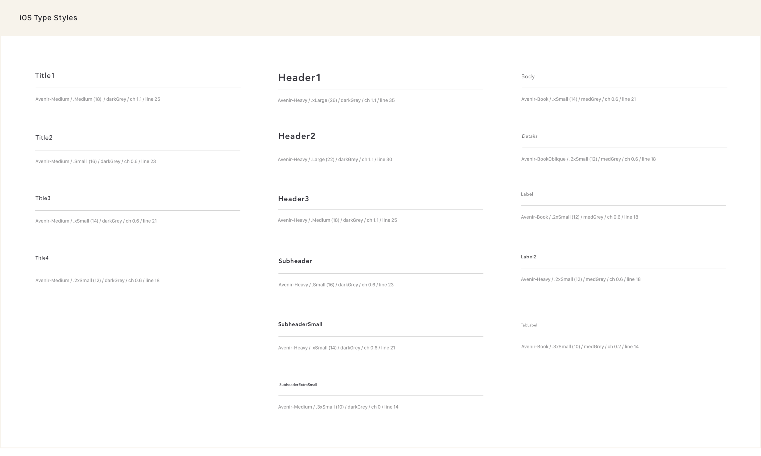
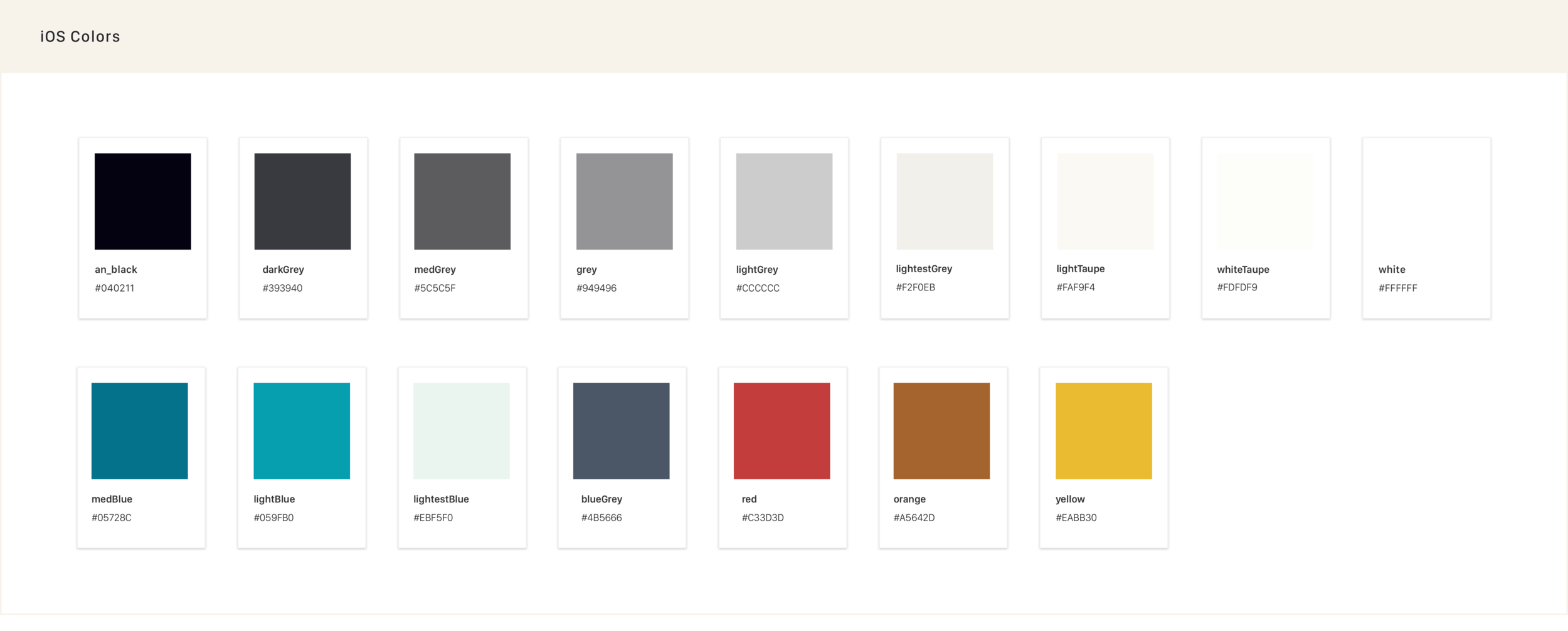
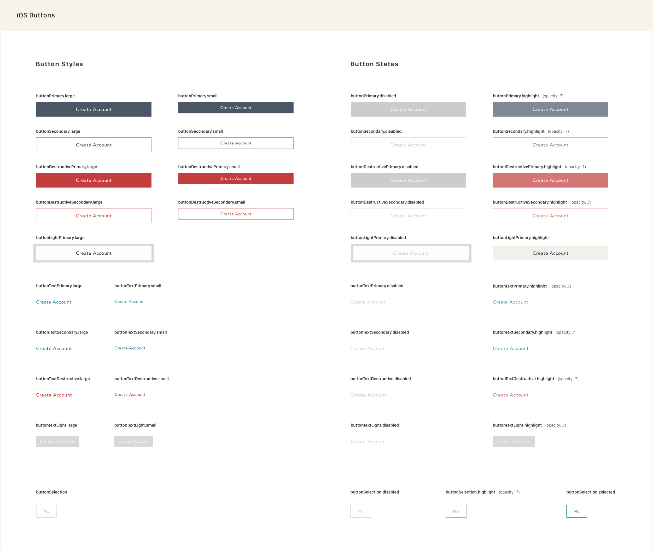
Typography, Color, & Buttons
Using our web styles as a starting point, I explored our typographic and color systems through rounds of trial and error and design reviews. To test out the design system, I explored the styling of the major sections of the app, then slowly built out the rest once the system felt established. Throughout the process, I ensured that the type size and hierarchy were clear and the colors passed contrast requirements.
Iconography
I created custom iconography for the new app, diverging entirely from icons used on our website to give the app a unique edge.
Coming to Alignment
Our teams worked closely together throughout the entire process to achieve designs that are similar in framework, but stylistically unique. For example, each brand now shares a tabbed navigation, the fourth tab being brand configurable.

III. The Finished Product
After rounds of QA and testing, the new iOS app successfully launched in May 2018. Since then, we’ve continued to make improvements such as adding trending search terms, a read reviews overview section, and much more.


